

Title sequence lasts for 4.40 minutes technically. Just long enough to establish all of the main characters and the setting, it finished just before the plotline really begins (boy meets girl). 10 Things I Hate About You is a teen romantic comedy from 1999. The title sequence starts off by introducing the setting, then it establishes all of the characters; however the titles introduce production companies, then actors, then the crew.
Appearance:
- (0.00) Touchstone Pictures Production Card – American Production Company – Production cards are almost always the first thing you see in film so this is credited first. As the only contributor to have their production card in the film and the first on screen from this we can connote that they were the largest contributor to the film, they are the biggest company. Touchstone pictures is actually credited twice – once with the production card and one in the font of the titles consecutively.
- (0.19) Mad Chance – Production Company, Jaret Entertainment – Production Company. They are the next companies to be credited. The fact that they are both on the same frame suggests that they either worked closely together to make the film, they were both small companies at the time, they didn’t contribute extreme amounts to the film.
- (0.30) 10 things I Hate about You – The Movie title appears before any of the action, you could say that it signifies the start of the ‘interesting bit’ of the title sequence.
- Actors credited first – Heath Ledger – The main actors are credited first, in order of importance, not appearance. Heath Ledger is the second actor to be named.
- Another actor – David Krumholtz – As the actors with smaller parts, or less fame, are credited there is more action behind the title – this could suggest that, although their names are mentioned in the title sequence they aren’t ‘important’ enough to be the centre focus of the frame.
- (1.30) Another actor – Susan May Pratt – Very minor actor almost last of the actors to be credited in the title sequence, implies her ‘importance’ in the movie is small.
- (1.48) Casting by – Marcia Ross & Donna Morong, Gail Goldberg – First of the ‘crew’ to be credited, they appear just after all the actors which is appropriate as they chose all of those actors.
- (2.43) Executive Music Producer – Ralph Sall.
- (4.40) Last title to appear – Director – Gil Junger – He is the director and therefore one of the most important members of the crew, he appears last just before the movie plot really starts to begin, almost as if he is lifting the curtain to his creation.
Font
Main Part: The font looks to be a teenager’s scrawny handwriting because the letters are all different shapes and sizes; being a teen rom-com this would be appropriate for the films demographic: high school teenage girls. The writing could be that of the main character a she is often seen writing in her books. It also looks rebeliant and angry which is the characters attitude. Being from 1999 the font is quite old fashioned / cliché but apart from that I think that is still very appropriate for modern teenagers.
Secondary (Role) Part: More professional artificial font, this is used to show the peoples roles in the film – it’s the business side of the title so needs to look more professional. It takes away from the theme of the writing and the ‘younger acting’ jobs to connote to audiences that these people played a crucial professional role in the film.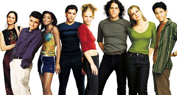
Colour
Each different title has its own colour. The colours randomise from – green, blue, red, yellow and orange. These colours are from the colour scheme of the posters etc. The colours are not particularly girly – there are no pinks and even the red is more of a brown, which reflects the main characters perspective – she’s more of a tomboy and rebels against the classic girl image.
Positioning of titles
The first titles (1-7) are positioned in the center of the frame, overlaid over the action. This suggests that the action isn’t very important to the plot yet, and the people who are being credited are important. The later titles (8-9) are positioned more to the corners of the frame, still overlaid but not right over everything. This could connote that the action is starting to get more important and so the audience need to pay less attention to the titles and more attention to the action.
The titles are shown overlaid over a shot of the camera sweeping (panning) over the setting of the movie. I think for this title sequence overlaid titles work a lot better than intertitles would because intertitles take you away from the action of the scene. The effect of having overlaid titles is that the setting is made a key part of the opening; after all virtually the entire film is set at the school.
Entrance and exit of titles
Most of the titles simply fade in and out, however the font makes a ‘scribbling movement’ which furthers the idea that the font symbolises handwriting. The ‘scribbling movement’ also connotes the anger of the main female role, as it looks quite frantic and when some people get angry they scribble hard on paper. The simplicity of the entrance and exits is common of a title sequence, because simplicity looks more professional, if they use too many ‘funky’ transitions it begins to look cliché and silly. (Unless they use it like in the case of superbad for exactly this effect – to set the silly mood of the film. This film, although funny, is not very ‘silly’ so doesn’t use the same transitions.) Also the titles can’t use too modern editing techniques as this film is from 1999 and the budget wasn’t huge.
Note on the conventions of romantic comedy openings:

In the openings of romantic comedies the conventions are clear, characters must be introduced as their journey to find love is the whole point. When looking at the comedy side of things the convention is relatively easy – make things funny in some way or another – make it ironic, or a strange pairing of people, make one of the love interest characters funny, or just make the situation they are in funny.
From this opening sequence I would like to take the simplicity of everything into my opening sequence. Without really realising the audience member can already recognise most of the key members of the cast and have even been given a tour of the setting. I want to use this effortless style of introduction in my opening sequence.
