Target Audience Feedback:
The video bellow shows the key points of what my target audience liked about my sequence:
I am over the time limit for this project, what do you think I should cut out/ down and why?
My target audience said that they didn’t feel like I’d cut anything vital and were happy with the cuts that I made. They said that the revised sequence flows a lot better as there aren’t as many cut-aways to different dates which had started to get a little confusing. One person especially liked how I cut the ‘date minus 3’ title at the very end which I had intended to cut out because it had been confusing.
I have made a date counter on the screen to help show that the sequence is not in chronological order, how can I improve it?
Now that I’ve moved the date counter a little higher my audience say that it’s a lot easier to see, this means that the fact you were cutting to different dates in non-chronological order became clearer. They also noted how it remains on the screen now rather than just ‘flashing back and forth’ which they say looks a lot better. Another thing they really liked about the changes I made was the new film title. They said that they all noticed it this time round and said it was a lot clearer that that was the actual film title rather than just another title; this was mainly because of the white background, and how i’d made it larger on the screen. They also liked how the ’35’ is the same as the date counter so that the film seems to have a running theme.
How well does the soundtrack fit with the video?
They mentioned how Mark’s voice was a lot clearer and it was easier for them to understand what he was saying. They all already commented on how much they liked the music and were happy that I had not changed it.
Success in terms of opening sequence and indie romantic comedy genre conventions:
Opening Sequence Conventions:
It’s got to have some form of titles which credit the main people involved in the film process. I have a variety of titles which credit production and distribution companies, costume design production design, original music, casting, film editing, cinematography, producers, actors, writer and finally the director. All of these roles, excluding acting, were me however in order to create the feel of an actual opening sequence with a variety of roles I used some other names. I am really proud of how all my titles turned out:
Production Cards:
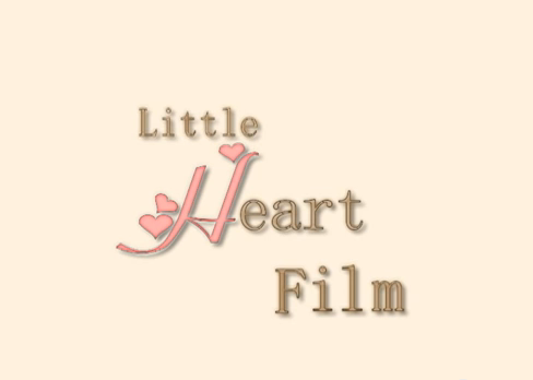

I like my production cards. I think their simplicity helps them to look professional even though we were only able to use livetype. I think they could easily be associated with an indie romantic comedy so are successfully believable. Panda Productions is quirky and random so could be associated with an indie comedy. And Little Heart Film has obvious romantic connotations. The only thing I dislike about them is that they do not appear on the screen for long enough because I could not get livetype to allow me to maintain the animation for a longer period of time.
Overlaid Titles /Getting Ready Shots:

I am really proud of how these titles turned out and my audience were pleased with them too. I think that the quirkiness helps to signify the indie comedy genre and this type of editing adds a bit of originality in my sequence. I’m also pleased with the actual shots themselves because I think they are funny. Mark’s facial expression when he’s cleaning his teeth is very unglamorous and realistic which I think sets up his very honest characteristics well. Also when he tries on the bow tie it builds his geeky images and he looks a bit silly which is equally funny.
Inter-titles:

I used this type of title to add a little variety to my sequence. I think the font choice connotes something quite innocent and fun which is similar to my genre while still being clear and easy to read. I think that the duration they are on the screen is enough so that you can read them and when I asked my audience if they were able to clearly read all of my titles they said yes.
The main character or setting is normally introduced. Bellow I talk about the main shots that introduce the character of Mark.
V-logging Sequences:

I am fairly happy with how these turned out however I do think there are problems with them. Firstly, despite my efforts to light Mark in a way that was adequately bright while still looking reasonably natural there is a problem with shadow on Mark’s face. His eyes are always in shadow which gives some subtle connotations of darkness when he is really a harmless guy. Another interpretation could be that he has a bit of mystery about him which would be revealed through the course of the film – this is true and this sort of interpretation would be fine. At any rate it was not entirely what I wanted. I like the framing of the shot as Mark stays as the center focus for these shots. His direct address to the camera and, therefore the audience, allows the audience to further connect with the character so I think I directed the actor well.
Flashback (cutaway):

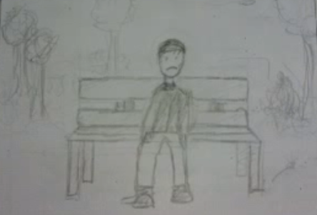

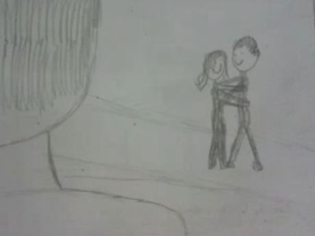
In these shots I establish the main setting – a town in England – which is somewhere relatable for my audience who mainly come from the working class. Overall these three shots turned out pretty close to how I had planned which shows that the storyboarding process successfully portrayed what I wanted in the sequence. Still, I think that they could of gone a little better as I feel they don’t convey the enigma codes that I wanted. I had originally planned for the girl in the park to run up to another boy and they walk away together. This would convey that his previous girlfriend may have cheated on him which left him scared and bitter. The lack of the other boy means that the connotations aren’t as strong – it is possible that she just left him or they drifted apart. However it is still conveyed that there was history between him and his previous girlfriend which is what I wanted. I also like how well the voiceover fits with what is happening on screen so that the sequence looks and sounds smooth.
Indie Romantic Comedy Conventions:
It’s got to be funny, and the characters are normally relatable. At various points in the sequence I made things subtly funny and quirky. In the ‘Overlaid/Getting Ready Shots’ section I talk about how Mark’s facial expression and gesture make him look relatable and a little silly. It is always good to laugh at the silly things we do and I think this is something my target audience would agree with – this was reflected in the feedback as they said it was funny. Another aspect of comedy is portrayed through one of the settings of the dates – McDonald’s. It is quite laughable that a 20 something year old went on a first date to McDonald’s and there are enigma codes raised about why he would possibly go there.

There has got to be some form of romantic relationship explored. This aspect of my genre was very easy to impliment and very obvious for anyone watching to see. The film is about a boy trying to find a girl – he wants to go on dates and fall in love. Another more subtle method I used to singify my genre was my font choice. The little hearts around the ‘dates’ part of my titles have connotations of love and therefore romance.


