After much thought and asking my peer’s and tutor’s opinions I have decided that I will have the ‘leafy’ texture (left) in my opening sequence. I think that the production card is still very simple and this texture adds a little more professionalism to the design. The block colour that I had before (right) was a little dark and didn’t really connote the idea of bamboo and a panda’s habitat like I had intended anyway, so I think the leaves are more appropriate. When I begin to edit together my sequence I will make this minor change to the titles.
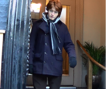
Today I picked out what the character of Mark will wear for each location / date. I have not picked out specific outfits for any of the girl characters but have simply told them to dress reasonably smartly.
Given my locations of local pubs and restaurants I thought that a suit would be over doing it a little bit so I instead have chosen a smart casual look. Mark will wear the same pair of jeans for each date however he will have a different coloured shirt for each date (this will also make it easier to distinguish between dates). Mark will also wear various coats / scarfs to show the passage of time between the dates.
For the first date the audience see, I plan for Mark to wear a smart coat – this restaurant is also one of the fancier settings – however in a later date wear the setting is just a small pub mark will wear a plain old jacket and hoodie.
To make sure that no one is hurt during the filming of my opening sequence I have produced a risk assessment to try and foresee any dangers we might face. Despite the fact that there is very little danger predicted in my opening sequence it is still a good idea to look at things from all the angles, the last thing I want is to responsible for someone getting hurt.
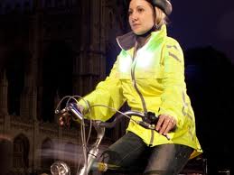
Travel: The main danger that I can forsee is the travelling to and fro from shooting locations because most of my cast are having to walk or bike. Me and my brother (Mark) are having to bike all around thetford to get to the various pub so there is a slight danger. We will take all of the necessary precautions we normally do when cycling on busy roads, possibly in the dark – high-vis jacket, helmet, lights on bike, and good road sense. If anything were to happen we always have our phones with us.
Location:Pubs/restaurants: Pubs can get very rowdy late in the evenings and it is sometimes dangerous for younger people (like myself) to be in that sort of environment therefore most of our filming at pubs will take place just after lunch so that we avoid the busiest times. We will only be at each location for a short amount of time so there really isn’t much risk.
Park: If you take out the ‘stranger danger’ aspect there’s no risk of filming at the park. I’ll be filming with my brother (who plays Mark), my friend (to hold my equipment), and the actress so we are a large group. From looking at the forecast for the next week a risk will be the weather however there is no risk of flooding in the area and for the most part we will be inside – away from the wind. The main risk is to my camera and tripod so I intend to bring some umbrellas and attempt to protect it from the wind and rain.
At each location I will always have my phone so if anything were to happen, I can always call someone for help.
I will finish up the animatic blog posts, print out my storyboard and scripts for my actors.
Monday 23rd
12pm: Organising costume for Mark
2pm: Filming at the park for shots where the audience see Mark sitting on the park bench.
5pm: Filming at The Black Horse for shots
8pm: Blogging about the costume choices
Tuesday 24th
10am: Filming at McDonald’s for the awkward date shots there.
Thursday 26th:
All Day: Reviewing footage from previous days filming to make sure everything is filmed that needed to be and then blogging about the previous days of filming.
Evening: Filming Mark’s solo ‘vlogging’ scenes at my house, and the scenes where he’s getting ready for various dates.
Saturday 28th:
All Day: Final day of filming – Shots: Graphic match of Malk walking into building and Mark walking out of pub.
I have discovered this texture (left) on Live Type which I’m considering using for my production card. I’m really not sure as I don’t want my production card to become too complicated and look unprofessional, however on the other hand I don’t want it to be too simple and look boring.
‘In association with’ slide should be a little longer, actually all titles could be on slightly longer.
Don’t like the mix of inter and overlaid titles because it doesn’t feel consistent however you may be able to asses this when toy are editing the actual sequence.
Main thought is that I have too many titles appearing too quickly and in different ways.
Excellent use of soundtrack.
Good variety of shot types and settings to establish genre very quickly.
Peer Feedback:
The peer feedback was mostly positive with people saying they:
Really liked the font, music and shot variety.
Liked the positioning and transitions between the titles.
Thought the genre was made apparent straight away.
Some of the feedback was more negative, some people said they:
Didn’t have time to read the titles
Weren’t sure if the overlapping of sound (sound bridging) was intended
Think some of the shots might need to be a little longer, but this will be more clear once you’ve filmed.
My response to feedback:
I agree that the titles disappear too quickly so that the audience would not have time to read them so I will increase each title’s duration by one second.
In relation to the where the titles should appear in the sequence I’ve become a little confused by the feedback as I have received two different opinions. One tutor said that they didn’t like how spread out my titles were, and would prefer them to be a little more close together, the other says that there are now too many titles at the start. To try and sort out this issue I am going to combine some of my titles so that there are less of them, however increase the duration that they are on screen so the audience will still be able to read them. Hopefully this will resolve the problem however I will continue to seek feedback on this after my third edit.
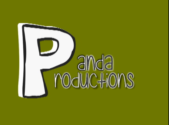
These are my production cards for my opening sequence. I used live type to create the titles and then to add the background colours I used Final Cut Express. Considering my genre I wanted the associated companies to be quite light hearted. A heart and a panda wouldn’t be expected to represent a horror genre so I think they are appropriate.
Panda Productions:
I think the randomness of ‘panda‘ productions is quite comedic which is appropriate for my genre. The animation on the ‘P’ is innocent and slightly childish which relates well to my character as he is fairly inexperienced in the dating world – and my audience relates to my character. I wanted my production cards to be simple (transition/ animations) because having looked at previous examples of student production cards the ambitous ones classically look cheesy and or unprofessional. I was able to find the fonts I wanted for this one on live type.
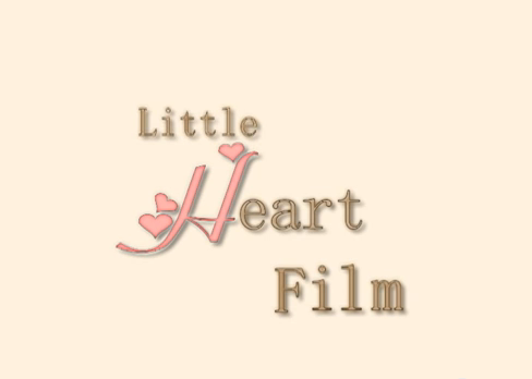
Little Heart Film:
I think this production card also has the right sorts of connotations: the heart connotes romance. I used the same font as my film title for the ‘H‘ because I knew that all capital letters in it had small hearts. I don’t think you can really tell that it’s the same font so I’m keeping it. I think that it’s soft colours show how they might be involved in innocent love stories. I like how simple it is and although it’s quite girly it’s modest.
I have a few more titles so that my opening sequence looks even more like an opening sequence, and also so that all the hypothetical roles have been credited. I have added a Costume Design intertitle, and an orignal music title to credit ‘Kallen’ whose music I have used.
I have implemented my chosen fonts into my animatic and have designed all my titles.
As well as this, I have designed my movie title…
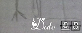
I have created my date counter.
I have rearranged the order of the titles and whereabouts they appear in my opening sequence:
First Edit Order: Production card, in assosiation with Barnes film, (+24 seconds) writer, casting, actor – overlayed, prodution designer, film editing and cinematography – overlayed, producer, (+54 seconds) director, film title, Date minus 3 (Fin)
Second Edit Order:Production card 1, Production card 2, in assosiation with Barnes film, (+18 seconds) Costume design, original music – overlayed, prodution designer, actor – overlayed, casting, film editing and cinematography – overlayed, film title, producer, writer, director, (+52 seconds), Date minus 3 (Fin)
I think this is better because: I have very slightly changed the timeing of when my music starts in my animatic so that it begins exactly as the first title appears.
What I’m Proud of:
I have a few soundbridges (give examples) which I think really helps my opening sequence to flow. I like the varity of shot and title types I have in my opening sequence because I think it will help to keep my audience engaged and interested. It also means that I have followed the course guidlines (give examples)
Next Steps:
I need to design my production cards. I have thought of a name and idea for the the first one – Panda Productions where the titles would be black and white and the background would be a textured green like bamboo. There is a US company called Panda Productions Inc. however there is no other well known production company with that name that I can find so I think I will be okay to use in. I have made a title saying in assosiation with Barnes film however I could make this as a production card as well.
To choose my font I used this website – dafont.com – which has a huge variety of fonts which are avalible to download for free and used with any program that uses fonts. You can search for the type of thing you are looking for and I found it quite easy to find a lot of what I was looking for – the difficult part was narrowing down what I would actually use.
Film Title (35)
I have chosen this font – for the counter part of my titles. It is simple but conveys the idea of something counting up or down. There were a few other fonts with similar formats however they mostly seemed very digital and more suited to an action movie rather than a romantic comedy. I don’t want my audience to start thinking of this:
When they should be thinking about a harmless flipchat about a man’s dating history. This font seems more suited to the ‘indie romantic comedy’ genre as well.
Film Title (Dates)
The second part of my film title has the right sorts of connotations for a company associated with the romantic comedy genre. The little hearts connote romance. Again, it’s quite simple and innocent so I think this design is appropriate for the main themes of my film.


![20140103_141305[1]](https://rosieannsmedia.wordpress.com/wp-content/uploads/2014/01/20140103_1413051.jpg)